The Don't Dead Open Inside layout

The most iconic enduring image from the first episode of AMC’s The Walking Dead is Rick riding around on that horse.
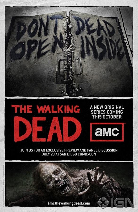
The second most enduring is the shot of a door that says “Don’t open” on one door and “Dead inside” on the other. It had a head start because it was featured in a promo image before the show aired:
The “Don’t dead; open inside” meme was an instant classic. I’ve decided to use it as a basis for inspiration for the new Cavepaint homepage. See if you can see it:

Which order do you read it in? Well, it doesn’t really matter. Each of the four elements offers something on its own. But in general the user will start at the top left (“Don’t”— the logo which selfishly takes up a lot of the page so visitors remember the name) and end at the bottom right (“Inside” - cavepaint.css there in all of its complex glory). The journey in-between is mostly up to whether they want to read or tinker with things.
It’s accomplished really easily, with the two-column composable. It composes with the tablet class so it all breaks down on smaller screens. So it’s two of these:
<div class=’two-column tablet’></div>Each with two children inside. Of course, you could just use one two-column div. But then that would be a Don’t Open Dead Inside layout. The Don’t Dead Open Inside layout needs two.
Does this layout work everywhere? Well, no. It’s actually bad for most things. Showing what a CSS framework is and what it does is inherently cumbersome, though, so it works here. It’s also optimized for revisits, so anyone can quickly drop in and grab a generated Cavepaint CSS.